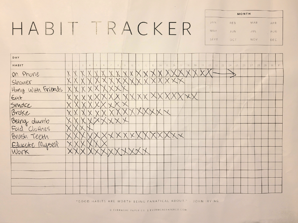
For this project, our class was tasked with tracking our own habits throughout a period of time to see if our behaviors had a greater impact than we realized. Afterwards, we would take the information from our research and consolidate it into an infographic. I initially only kept track of a handful of things I did throughout the week, but I decided to go with a repeated behavior not listed below that was really easy to track: how often I work at my job.
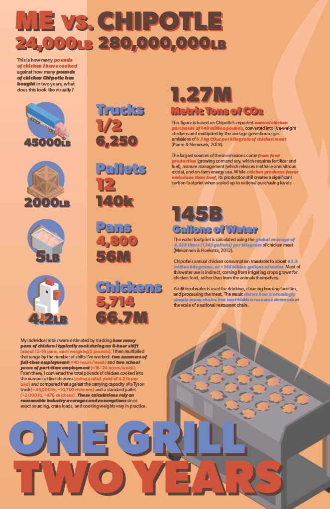
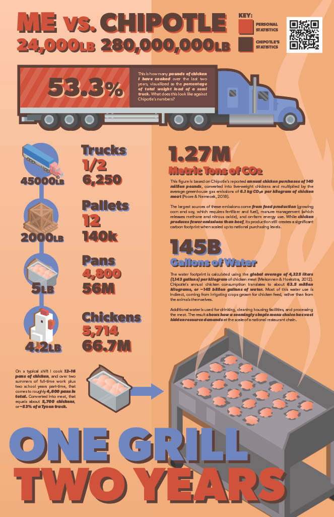
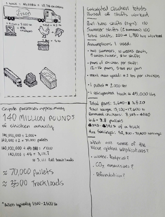
Specifically, being the lead cook at a Chipotle restaurant, the habit I tracked was how much chicken have I cooked in the two years I'd been working there. I was really interested in how many chickens specifically have I cooked, how much energy it took to raise that many chickens, and what are the global consequences for using that energy. As the person who enables the profit from the time and resources spent by Chipotle, I wanted to compare my ratio of cooked chicken to the total number of chickens purchased in a two-year span. The sketches below showcase some initial ideas of how I was visualizing the information, along with some loose estimates of numbers that I would later refine.

The next step was to take the visual concepts and research from the sketching phase and distill it into a visually coherent, legible infographic. I borrowed some of Chipotle's visual language throughout the iterations of the poster design. Through each addition, you can see how the important information becomes ever clearer, while also including new ways to visualize the information.