Substance Use Stigma & Public Health Messaging
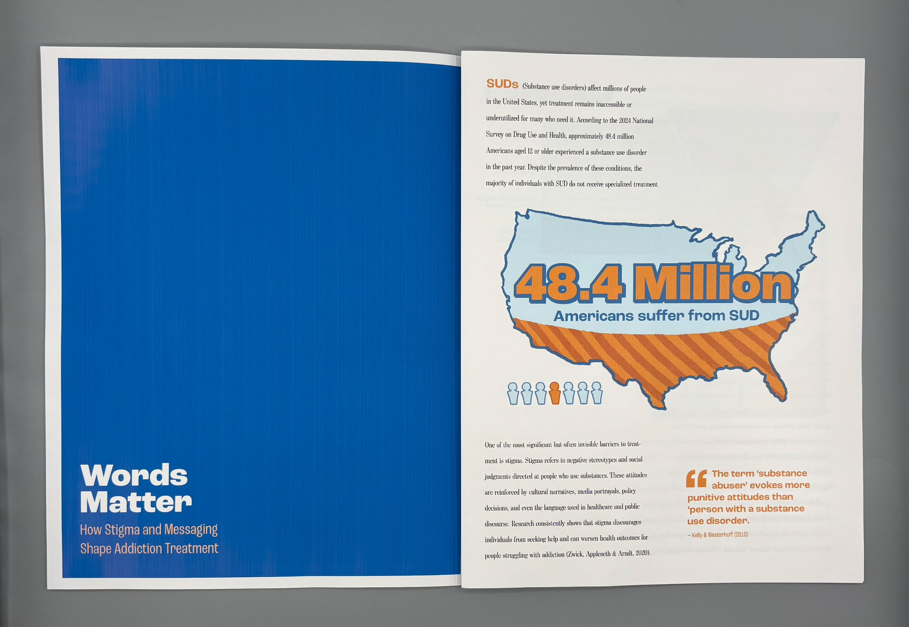
Substance use disorder affects millions of people across the United States, yet the systems meant to support recovery remain difficult to access, deeply stigmatized, and widely misunderstood. This project explores how design can clarify complex public health data and reshape harmful narratives surrounding addiction. By developing a data-driven editorial report focused on the relationship between stigma, messaging, and access to treatment, I set out to create communication tools that help audiences understand both the problem and the human experience beneath it.
Background
Across the U.S., only a small percentage of people with substance use disorders receive specialized treatment; not because treatment is unwanted, but because stigma, systemic barriers, and misinformation make it inaccessible. Public health communication plays a critical role in shaping whether people seek help, feel safe doing so, or trust available services. As a designer, I’m interested in how complex and emotionally charged information can be translated into visual formats that are both accessible and empathetic. In this project, I approached stigma not just as a social issue, but as a structural force that restricts access to treatment. My magazine article draws on peer-reviewed research, historical context, and national datasets to explore how communication design can shift understanding and reduce harm.
Why This Topic Matters
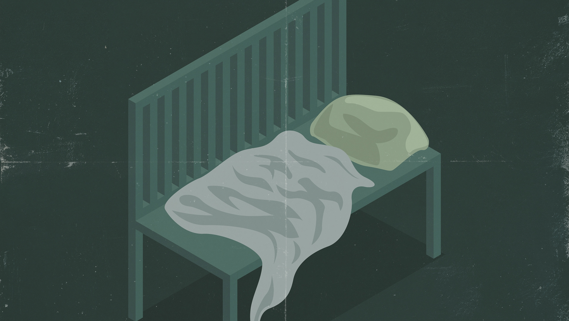
This topic holds personal relevance: my mother has struggled with substance use for most of my life. I’ve seen firsthand how stigma, not just the condition itself, erodes relationships, prevents treatment, and creates silence where support is needed. From a public health perspective, stigma directly reduces treatment-seeking behavior, affects policy support, influences clinical decisions, and shapes public perception. This project demonstrates my ability to translate sensitive, complex health data into human-centered visual narratives that improve understanding rather than reinforce misconceptions. I, as a designer, am uniquely positioned to reframe these conversations through empathetic communication and evidence-based messaging.
Aim of Article Design
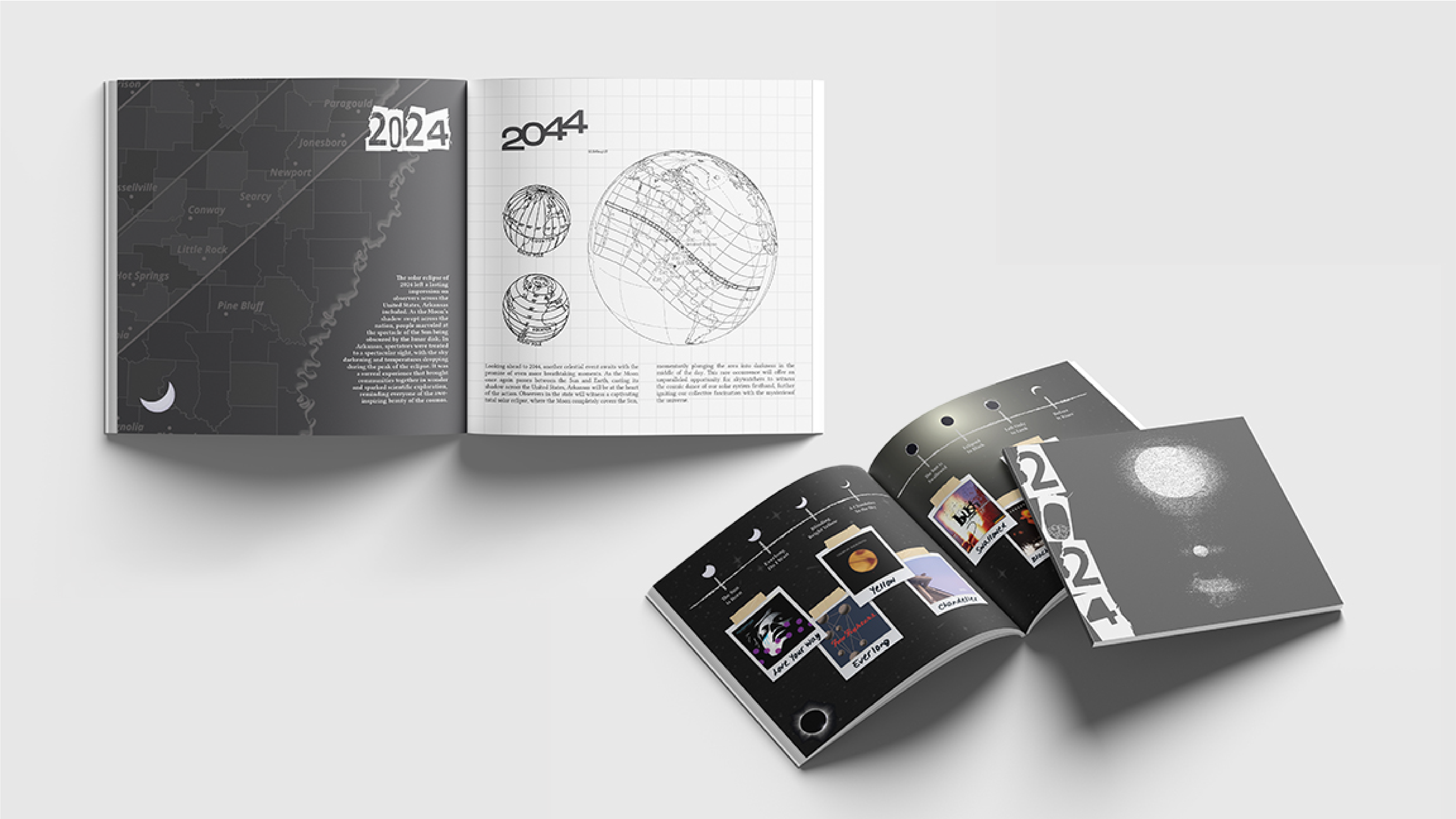
The aim of my editorial article was to identify how stigma functions as a barrier to treatment; Explain how language, policy history, and public messaging influence perceptions of addiction; Present data illustrating where individuals drop off in the treatment “funnel" ; and offer readers actionable insight into how words, policy framing, and community narratives can either reinforce harm or support recovery. The design challenge was to make a stigmatized, emotionally heavy topic readable, factual, and hopeful without simplifying its complexity.
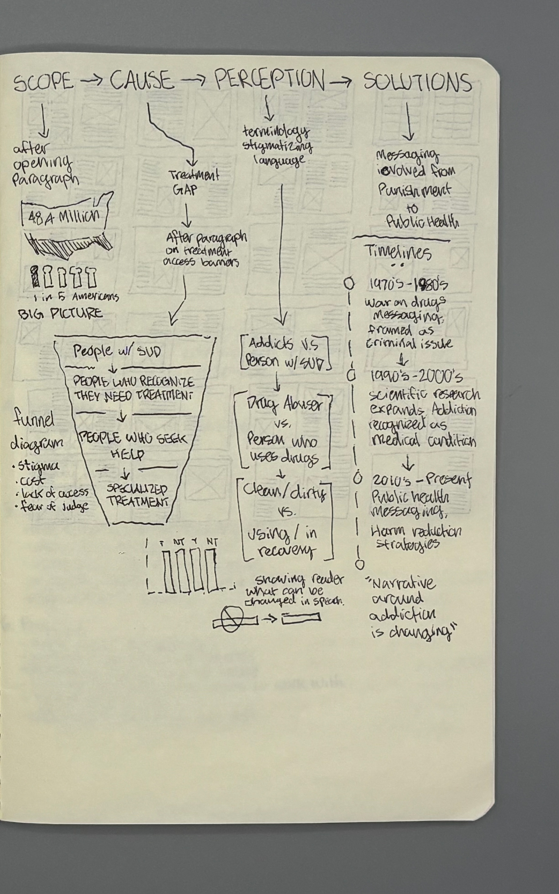
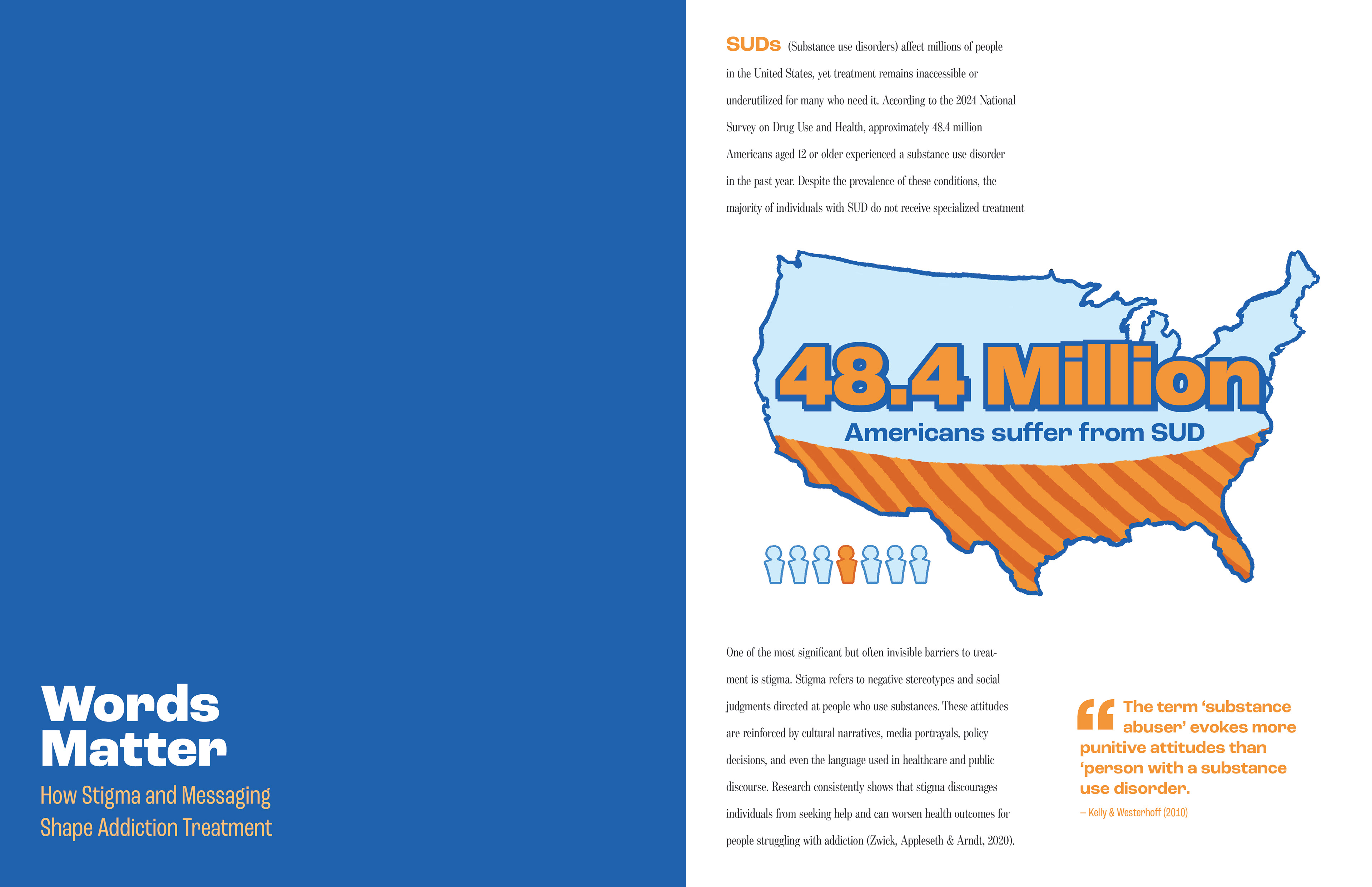
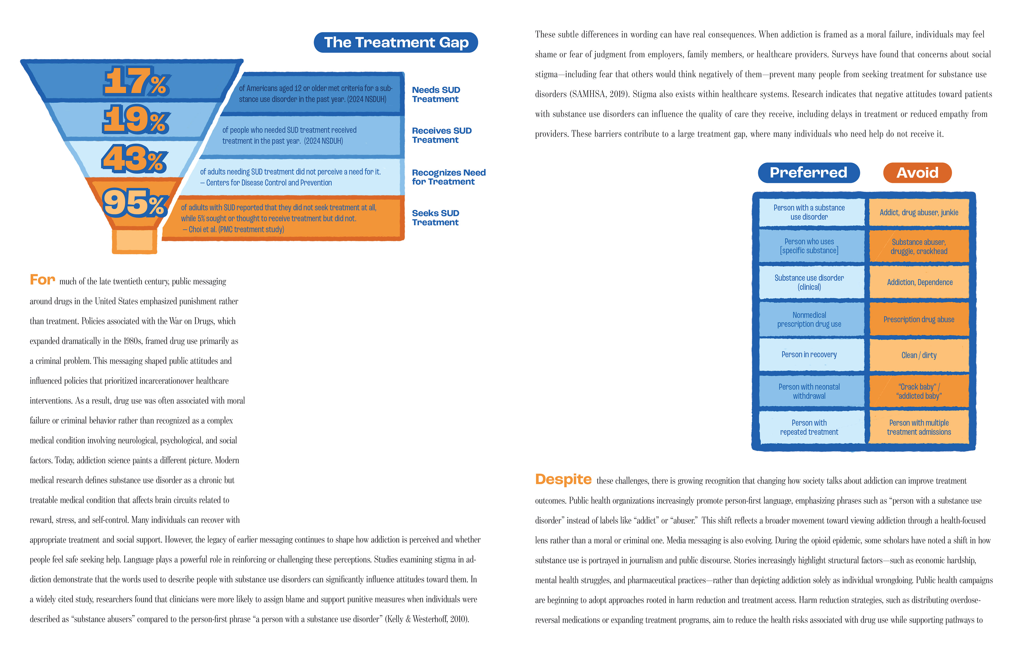
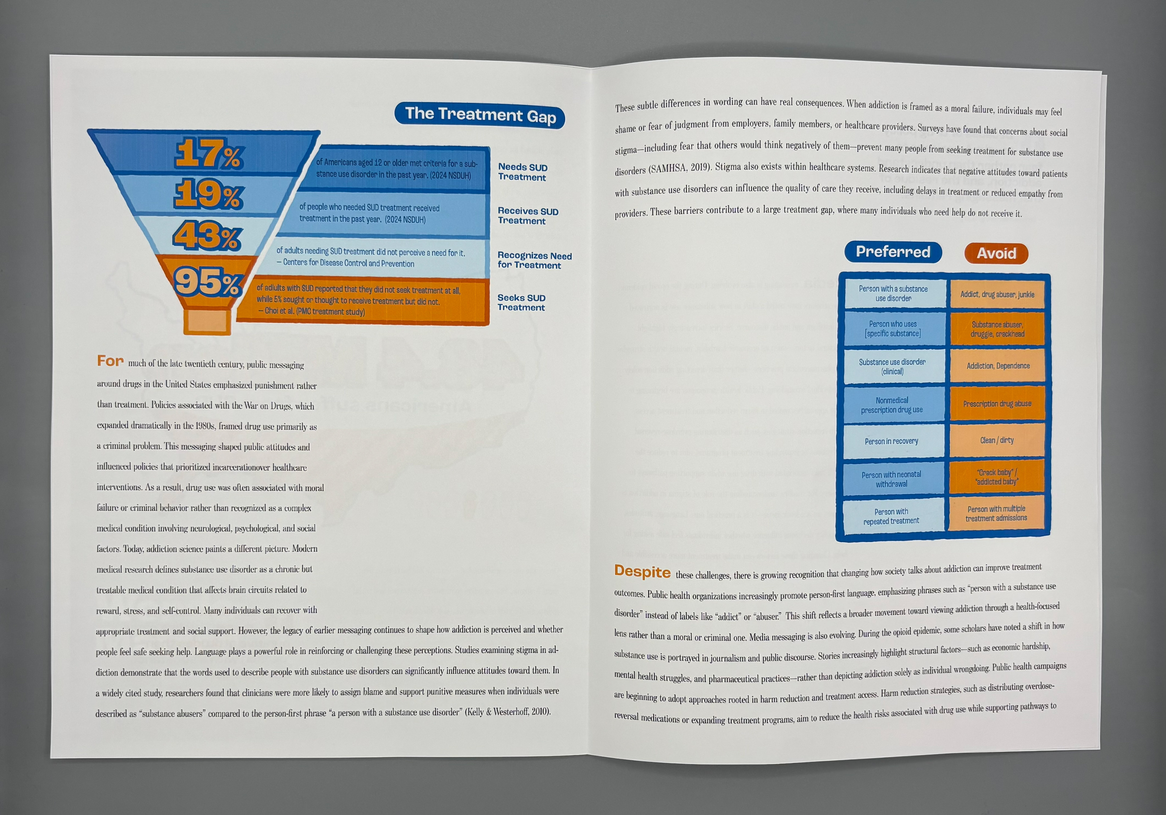
Funnel Diagram: NSDUH data informed accurate percentages of people who recognize they need treatment → seek help → receive specialized care.
Language Comparison Chart: Clinical language preference studies informed which terms reduce stigma and improve empathy.
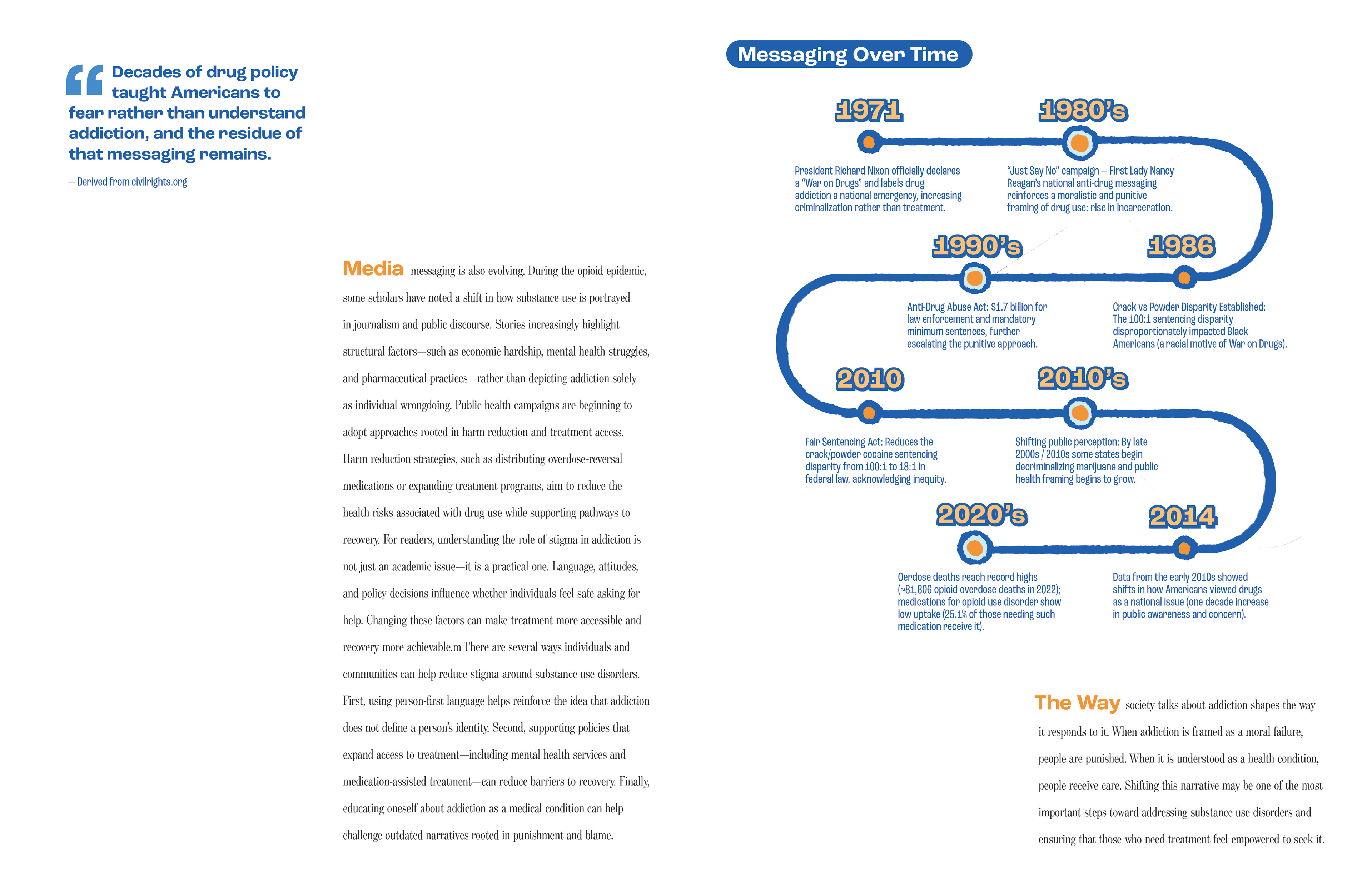
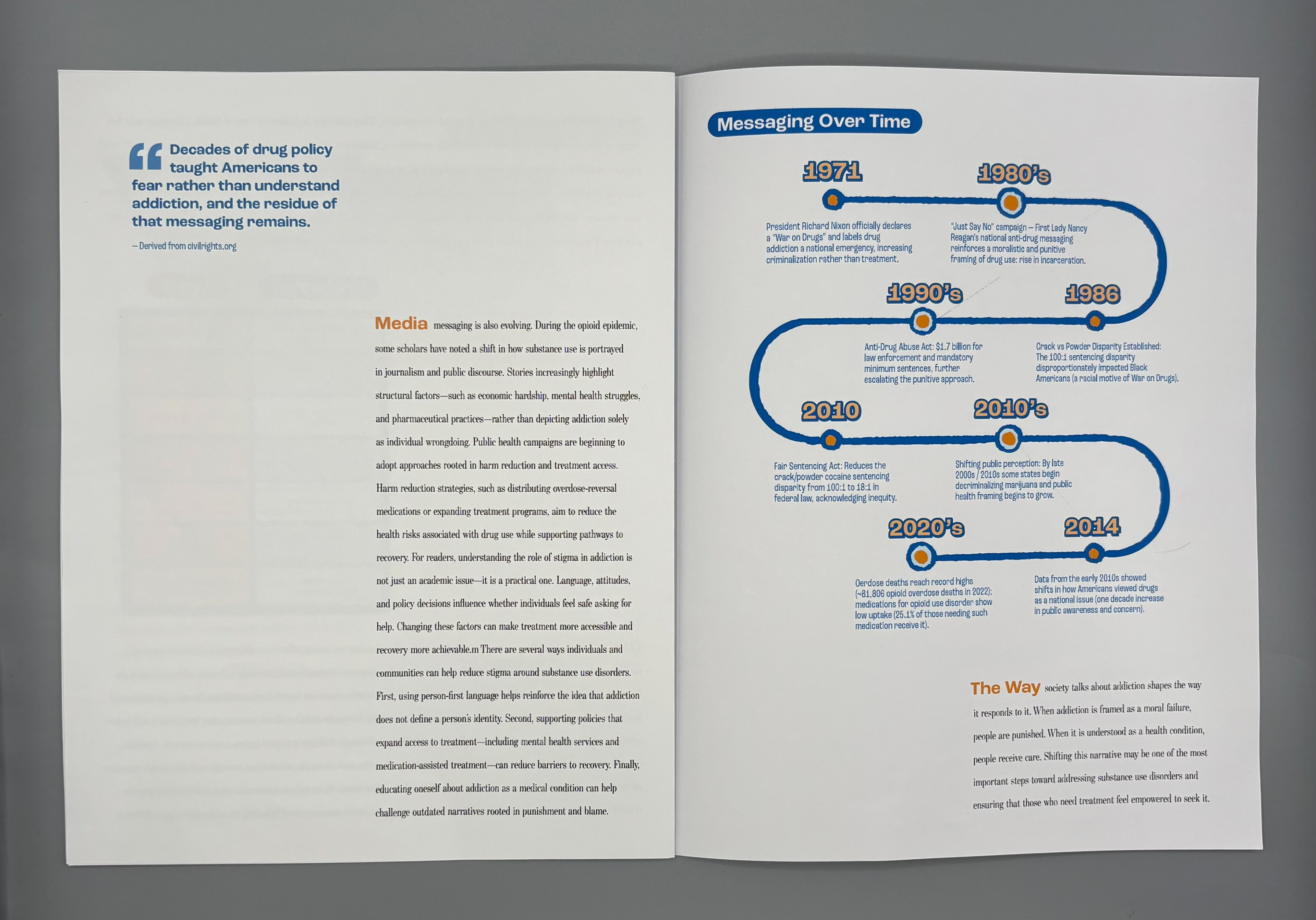
Historical Timeline: Policy and public perception data grounded the narrative in real structural origins, not anecdote.
Pull Quotes: Research-backed statements reinforced the emotional and systemic stakes. The research shaped both the visual direction and the narrative framing, ensuring clarity and ethical accuracy.
Research Approach
I took a systems-oriented approach to research, combining peer-reviewed public health literature (e.g., stigma, treatment gaps, clinician bias studies); National datasets (SAMHSA, NSDUH); Historical policy analysis (War on Drugs, racialized enforcement practices); Communication science (language framing, health messaging effectiveness)
I prioritized sources that quantified the treatment gap; analyzed how stigma affects help-seeking behavior; explored language preference and clinical bias; and connected policy history with modern public perception. This allowed me to create data visualizations that were not only accurate but also socially contextualized.
Key design aspects
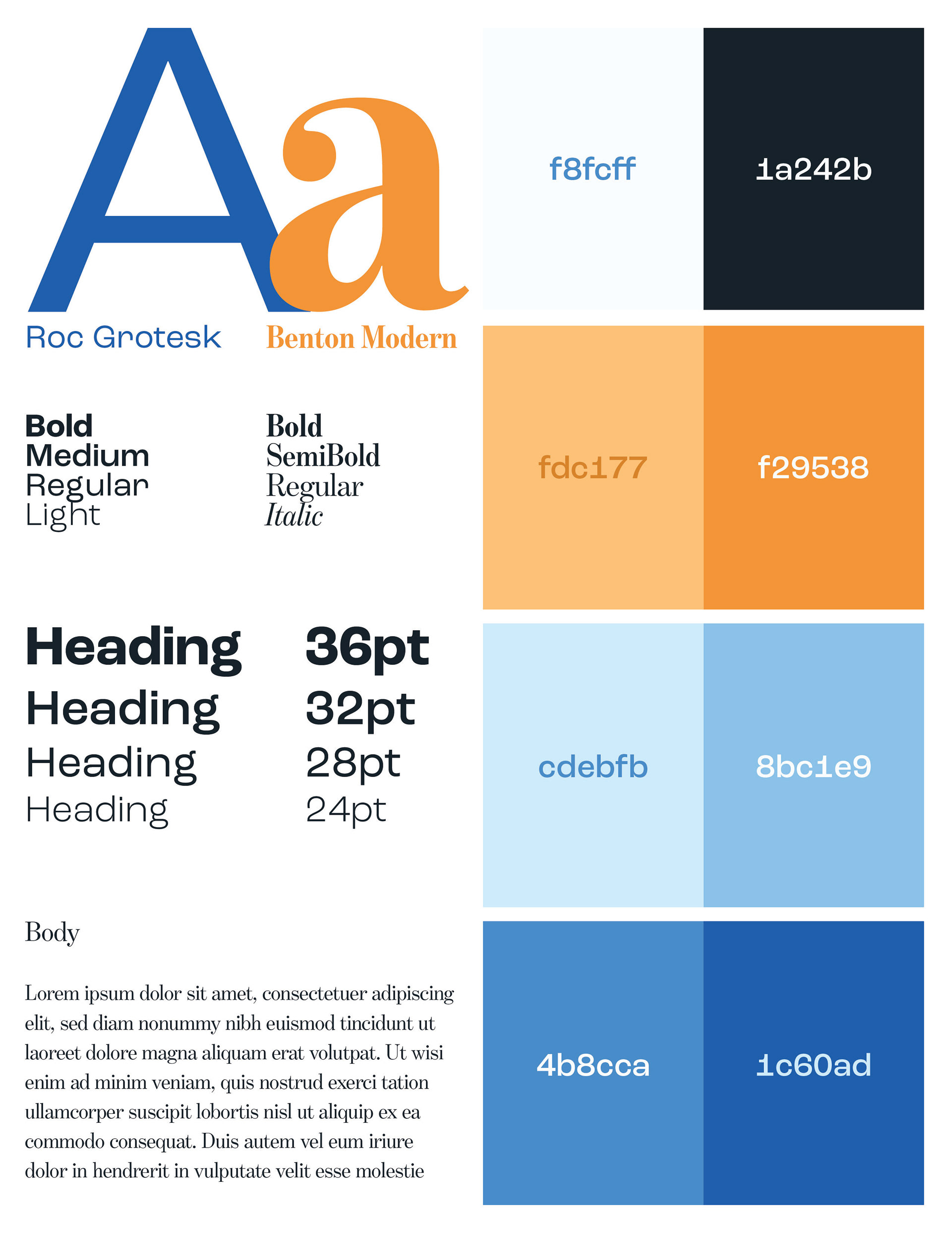
I designed the article using clean, medical-adjacent typography (clarity + seriousness); muted, trustworthy color palette (deep blues, oranges, and soft neutrals); rounded hand-drawn aesthetic and soft edges to visually counteract the harshness of stigmatized language; high-contrast data graphics designed for immediate comprehension; and ample whitespace to make heavy material breathable.
The tone and mood of the magazine is meant to be empathetic but factual; direct but non-sensational; and hope-oriented rather than crisis-oriented My visual decisions support my research through the overall aesthetic. It was designed to lower emotional defensiveness around a stigmatized topic; encourage readability; highlight systemic issues rather than individual blame; and build trust through both clarity and warmth.
Process: Design Evolution
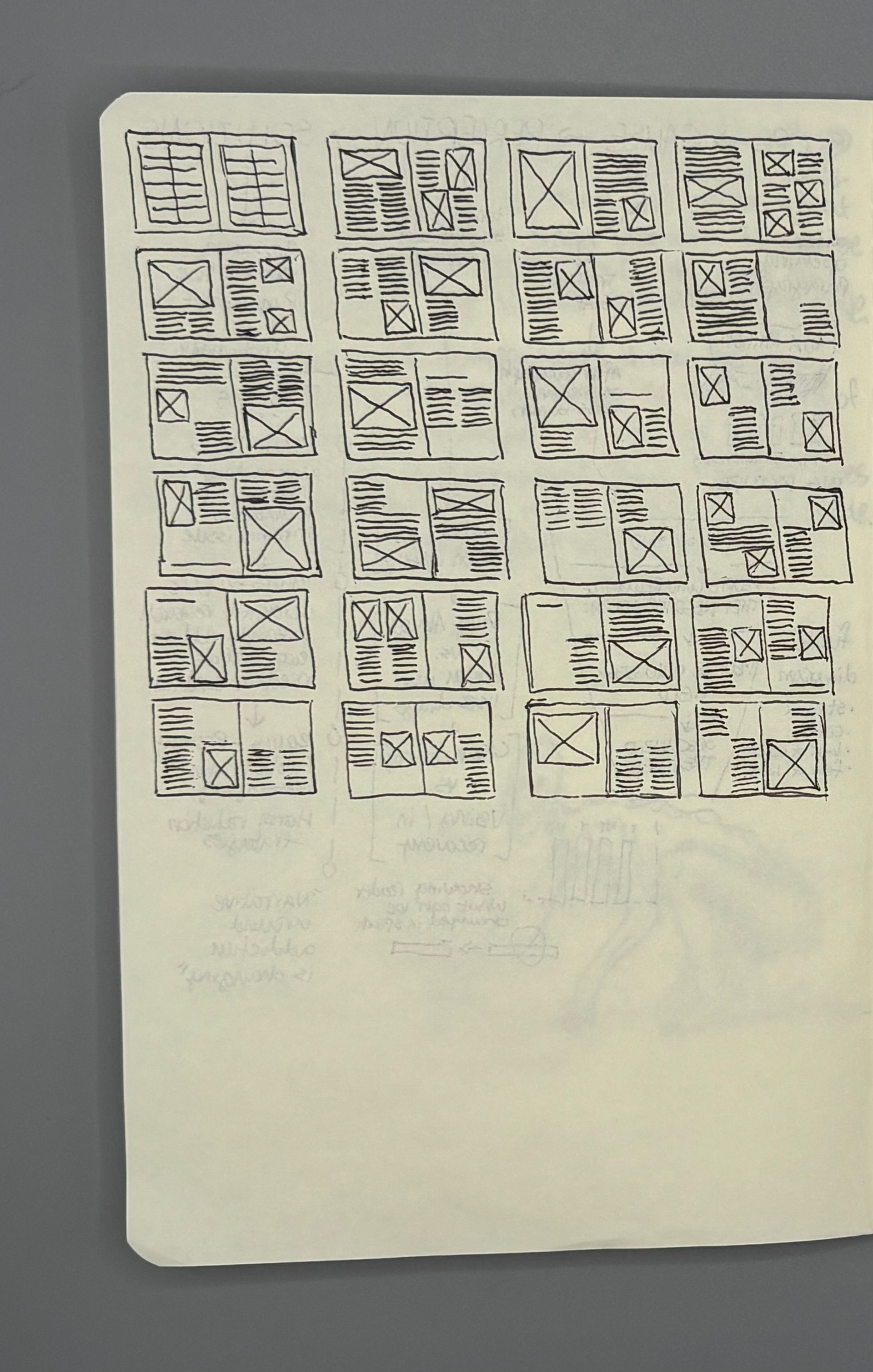
Phase 1: Data Exploration
I began by mapping the funnel of treatment engagement and identifying where the largest drop-offs occur. Early sketches focused on: Funnel vs. tree vs. circular diagram structures, Ways to represent people “falling out” of treatment pathways
Phase 2: Visual Language Refinement
I built a visual system that balanced: Rigor (accurate data representation), Human sensitivity (soft palettes, approachable typography), Legibility (clear hierarchy, bold headings)
Phase 3: Narrative Pacing
I refined the written narrative to weave: Personal motivation; Historical context; Research-backed arguments; Actionable insights
Phase 4: Iteration & Testing
I revised the layout based on: Peer feedback on clarity; Instructor feedback on pacing; My own evaluation of emotional impact; This led to more whitespace, simplified graphs, and reworded captions for accessibility.
Design & Complexity: What I Learned
Through this project, I learned: How deeply language shapes health outcomes; How to translate emotionally charged topics into clear, approachable design; How to identify ethical risks in data visualization (e.g., inadvertently reinforcing stereotypes); How health messaging must balance accuracy with compassion; How systems thinking strengthens public health communication design; How design can create understanding where stigma has created silence; This project reinforced that designers have power not just to communicate information, but to reshape how people understand health, care, and one another.