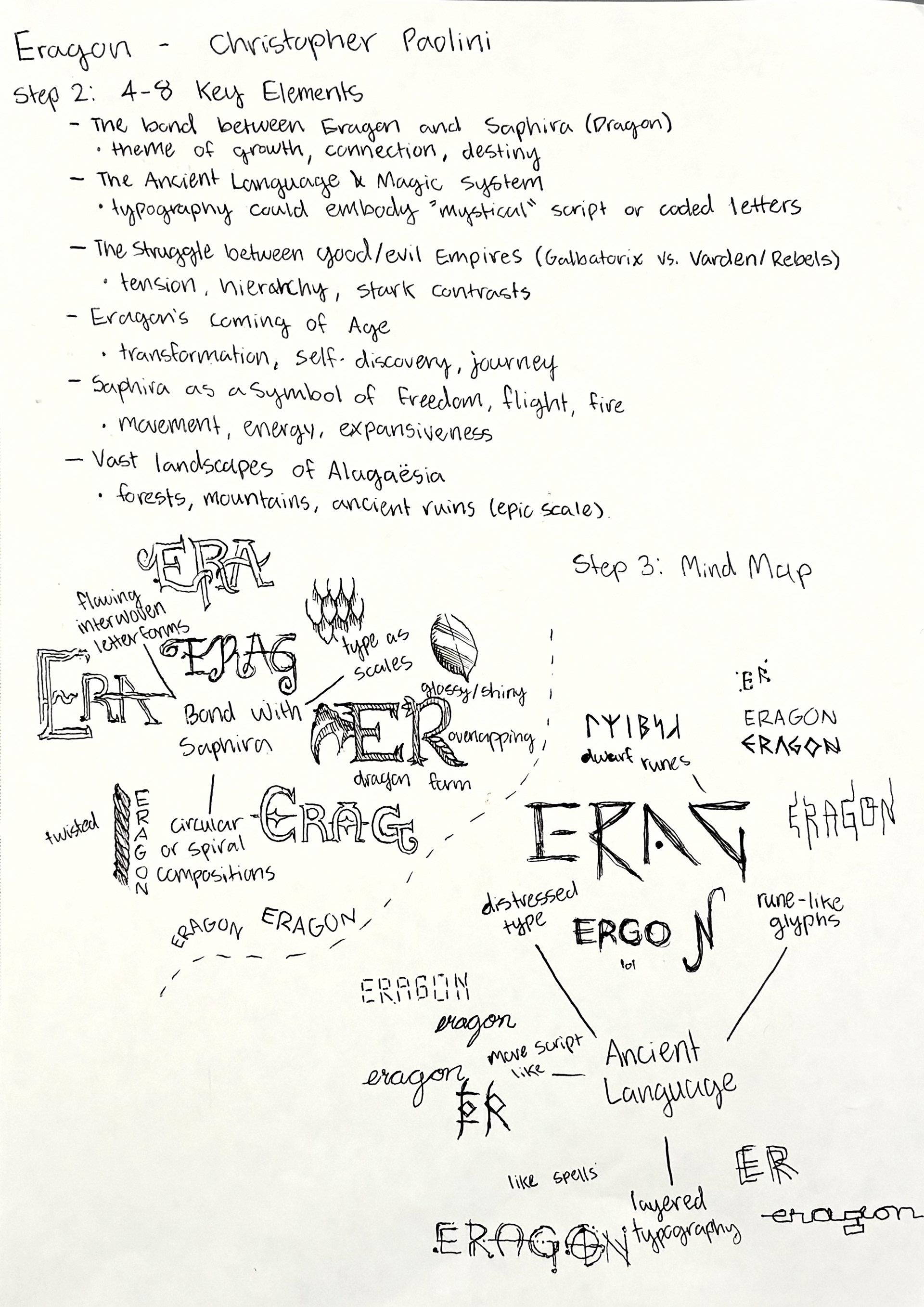
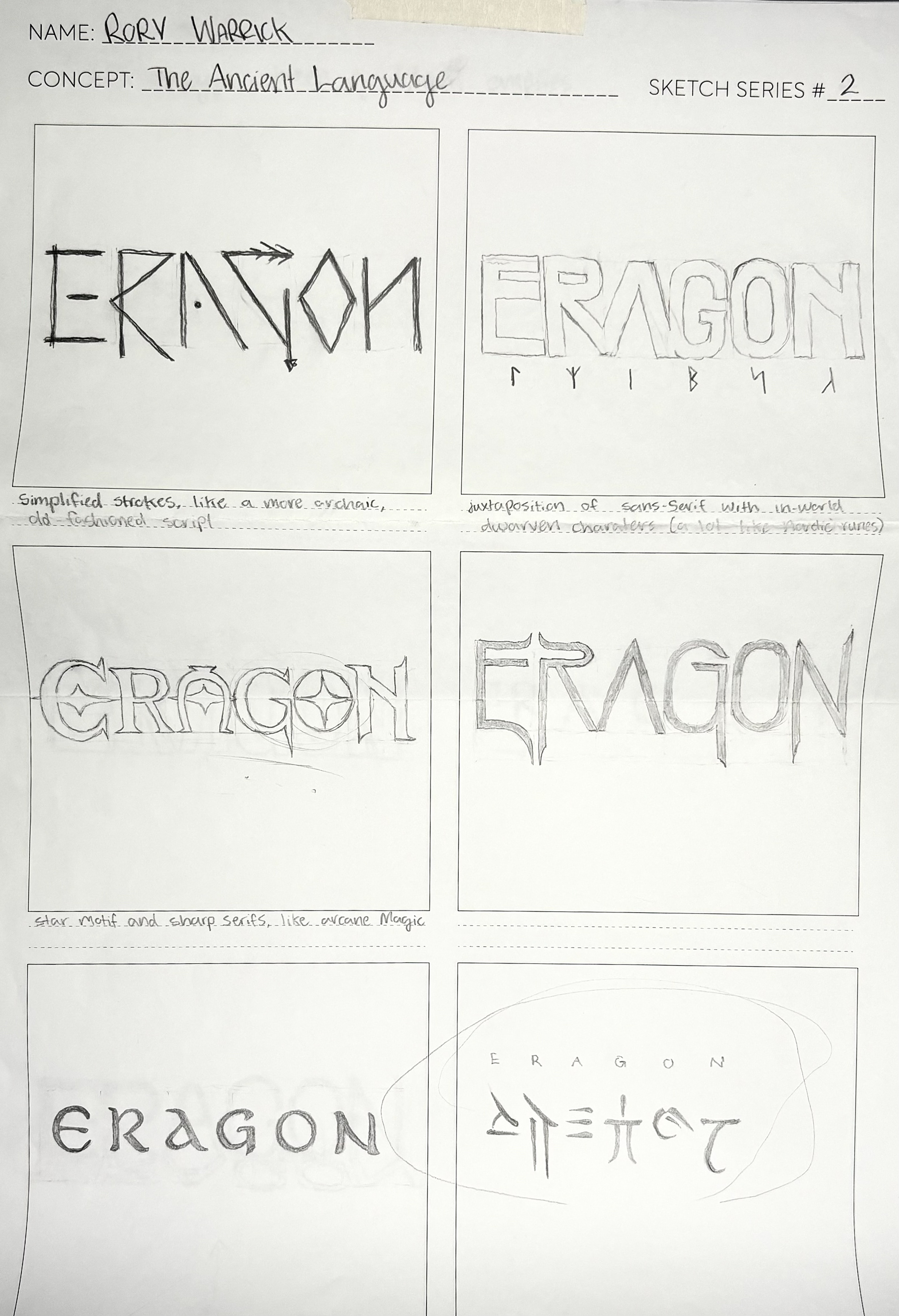
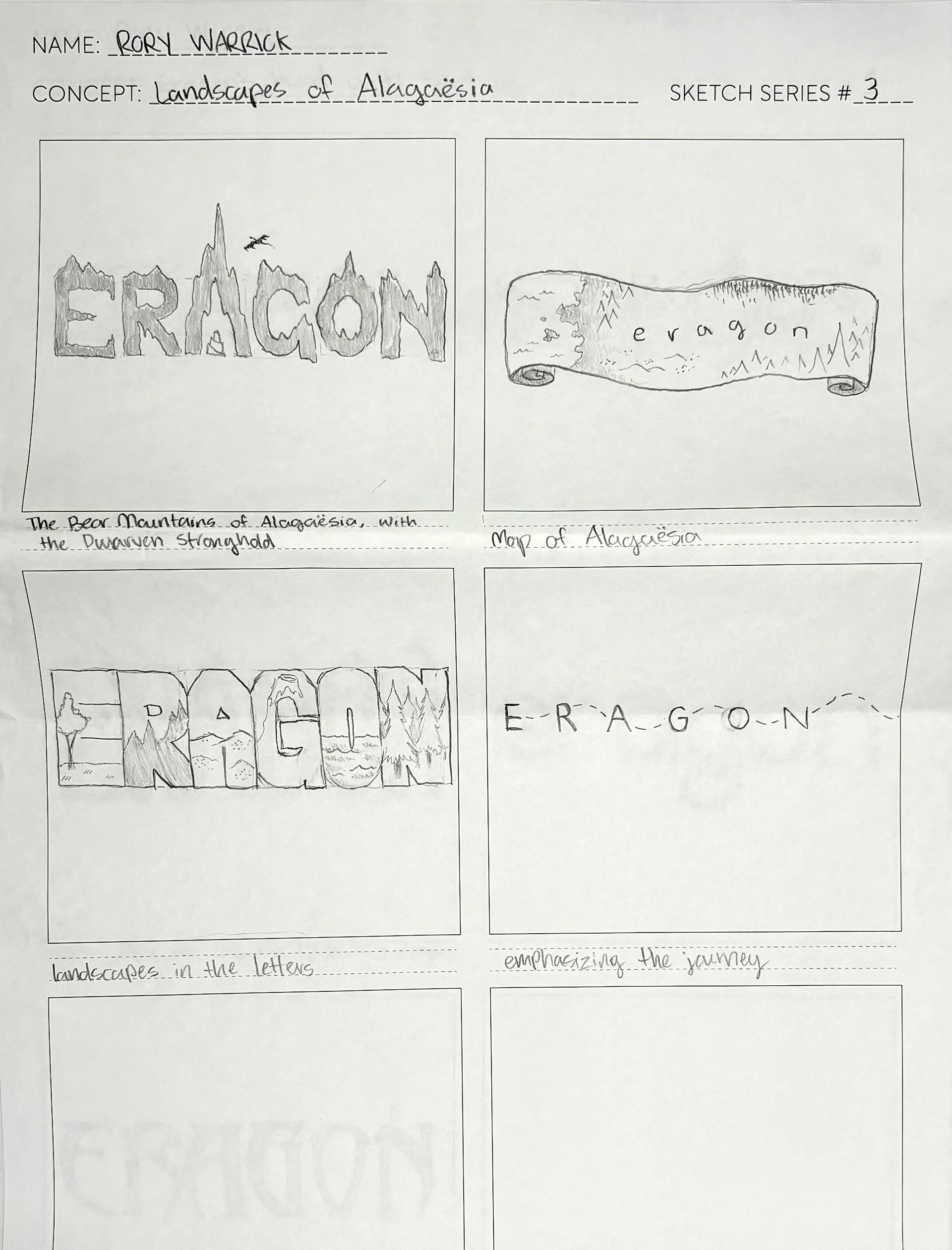
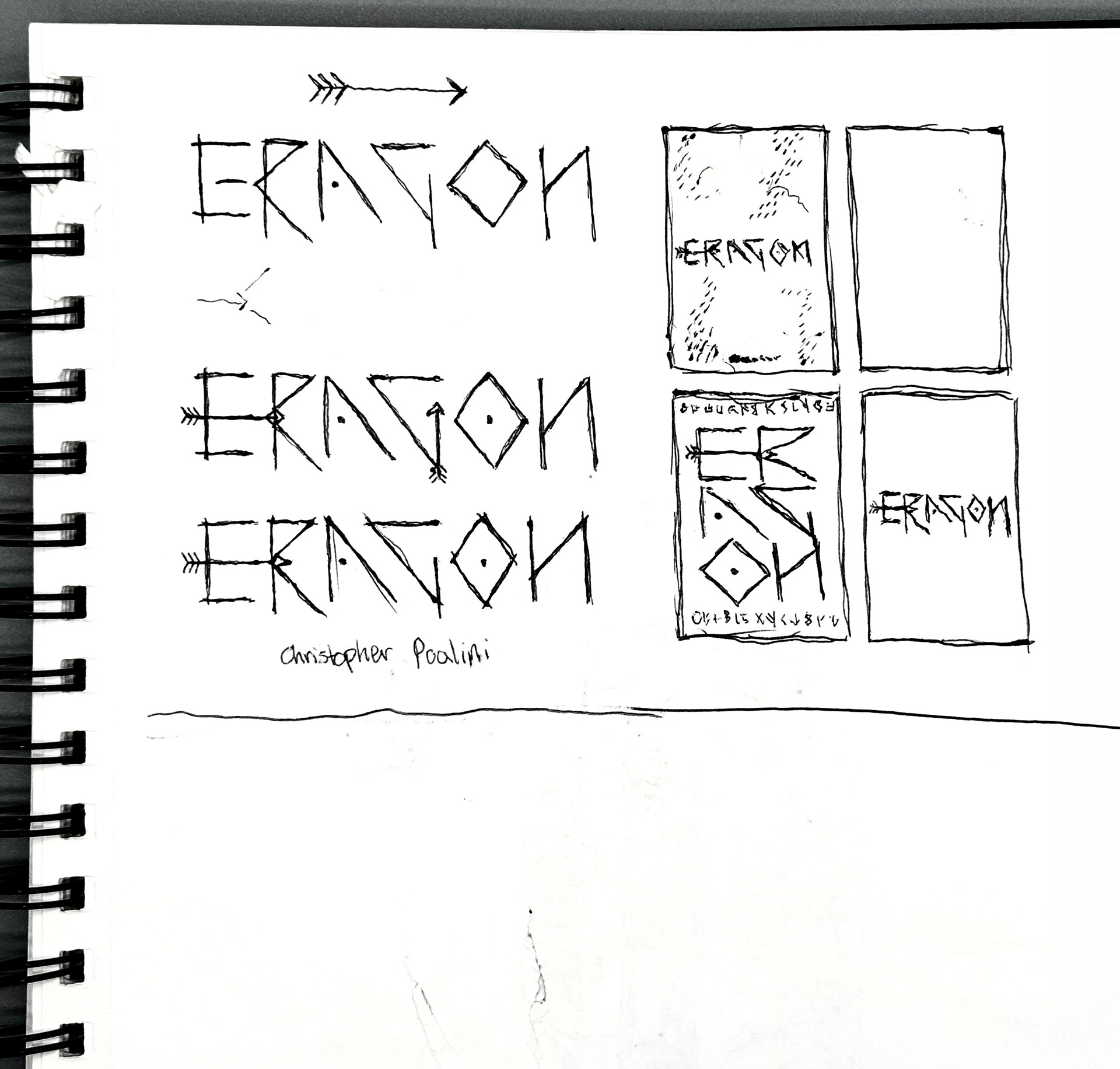
For this project, I was required to redesign a book cover of a story I've previously read, represent the book's narrative just using typography, and create an animation to showcase the cover's newly made typeface. I start by listing the major themes of my chosen book, Eragon by Christopher Paolini, and begin an initial sketch phase, consisting of a basic visual exploration.
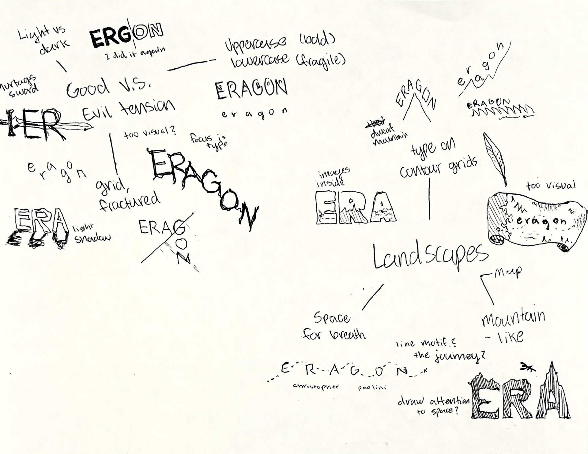
I take the ideas from my first round of sketching and develop my stronger directions, getting a better sense of the type options that could best represent my chosen novel. Each of the overarching themes has potential.
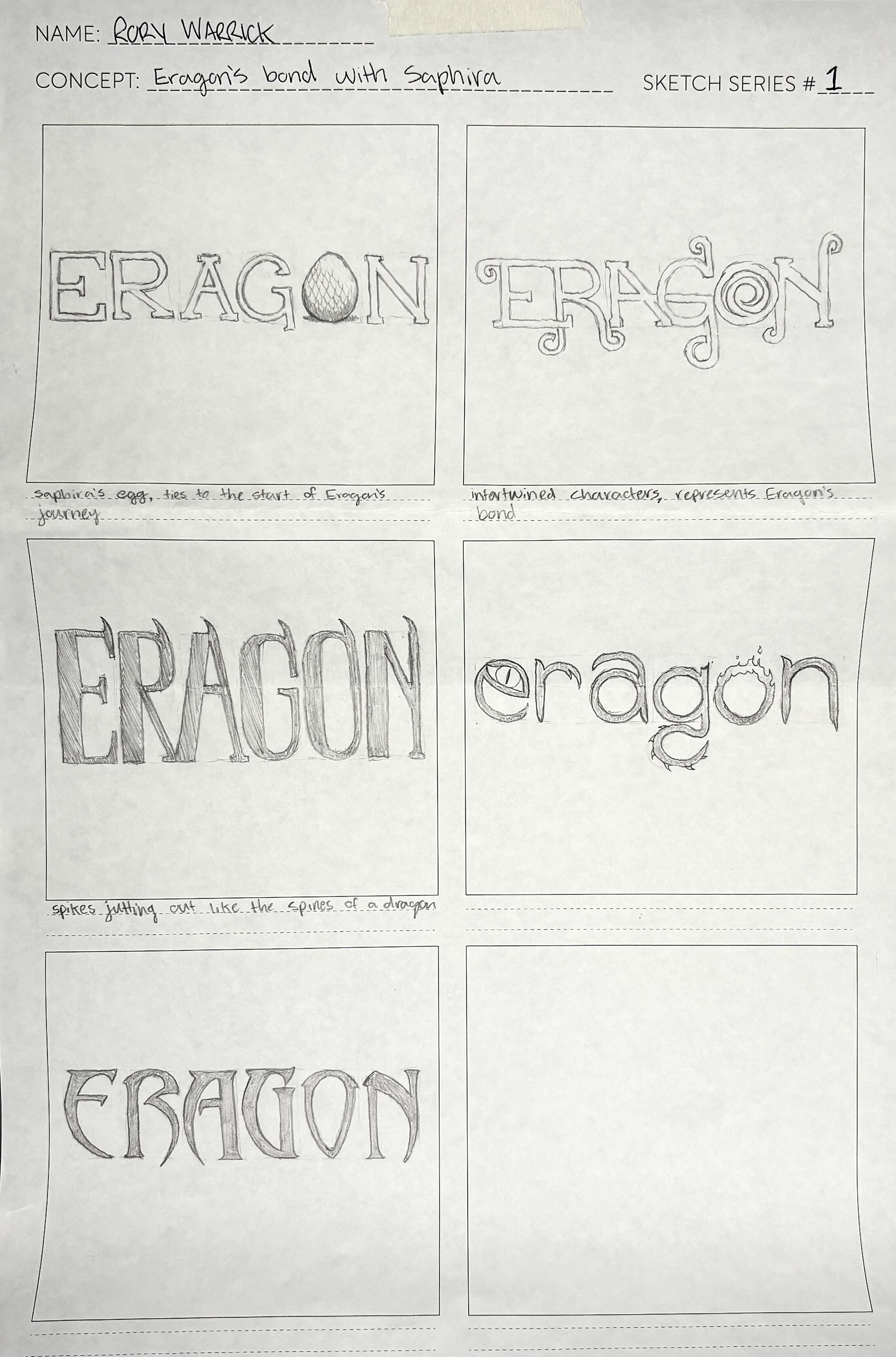
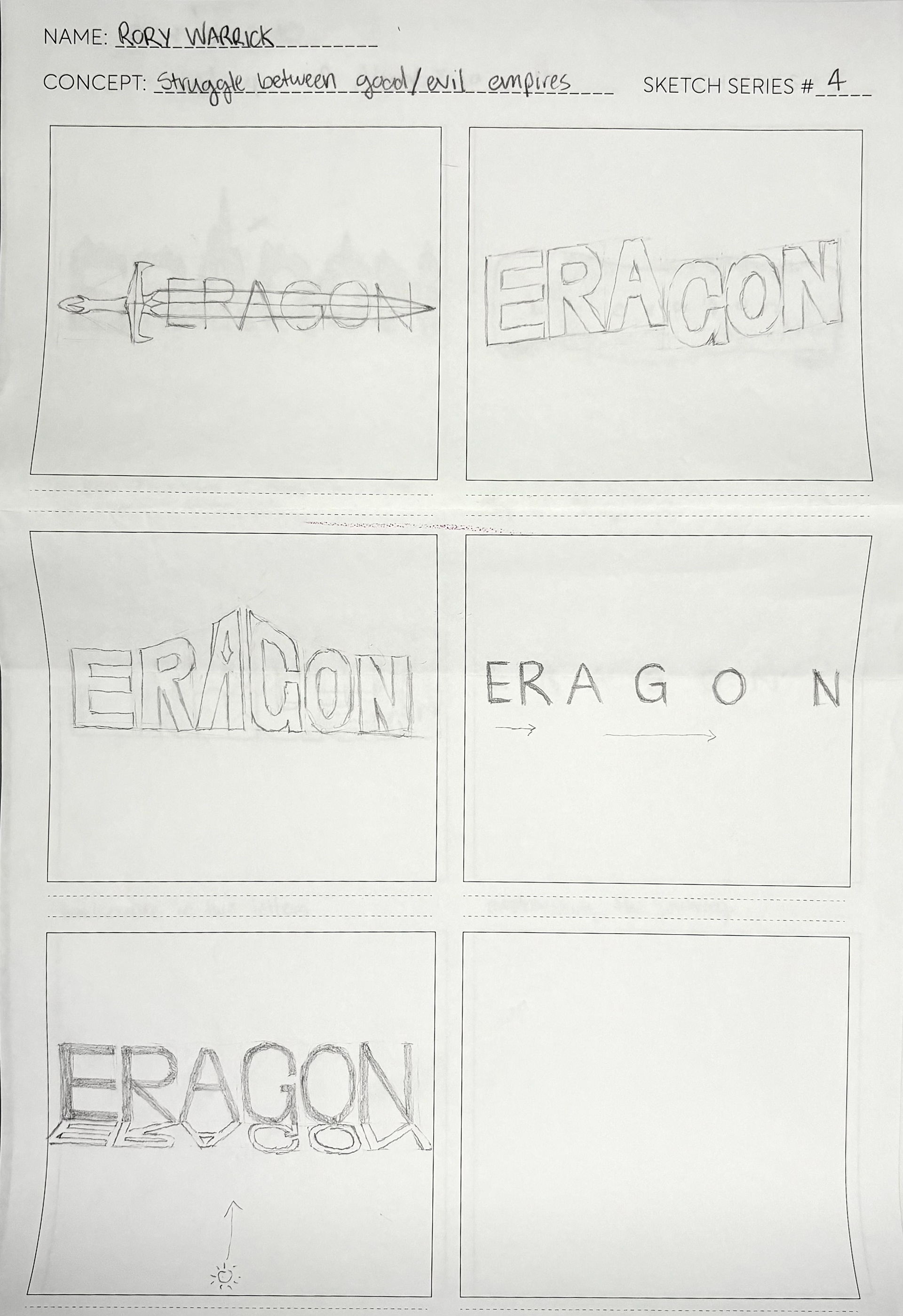
After choosing a direction and rendering a low and mid fidelity mockup of the cover's type, I was beginning to feel uninspired. Considering the time frame of the project, I went back to the drawing board, pulling another idea from my extensive sketching phase. My effort put towards conceptualization allowed for the quick turn around time of my second cover's design.
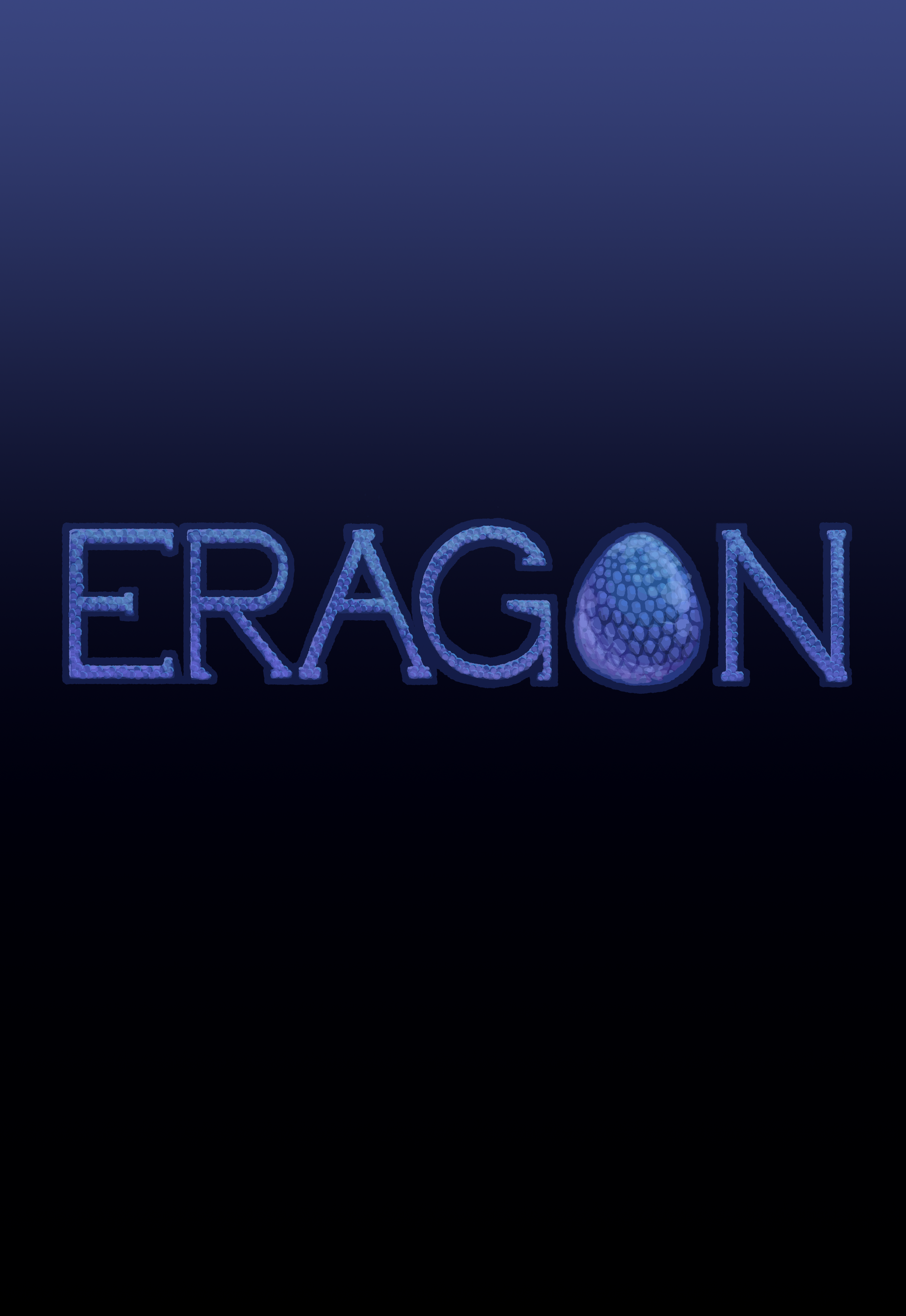
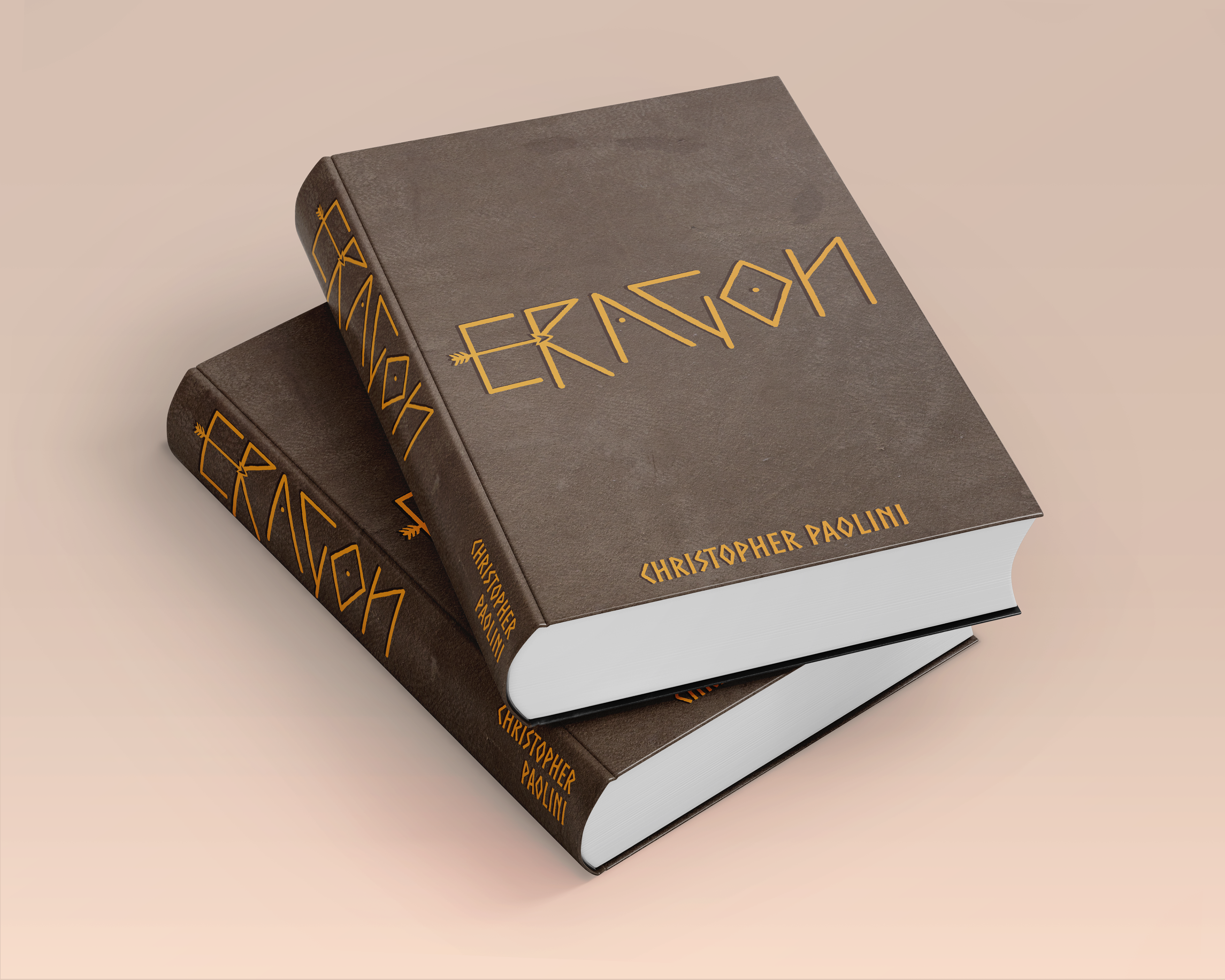
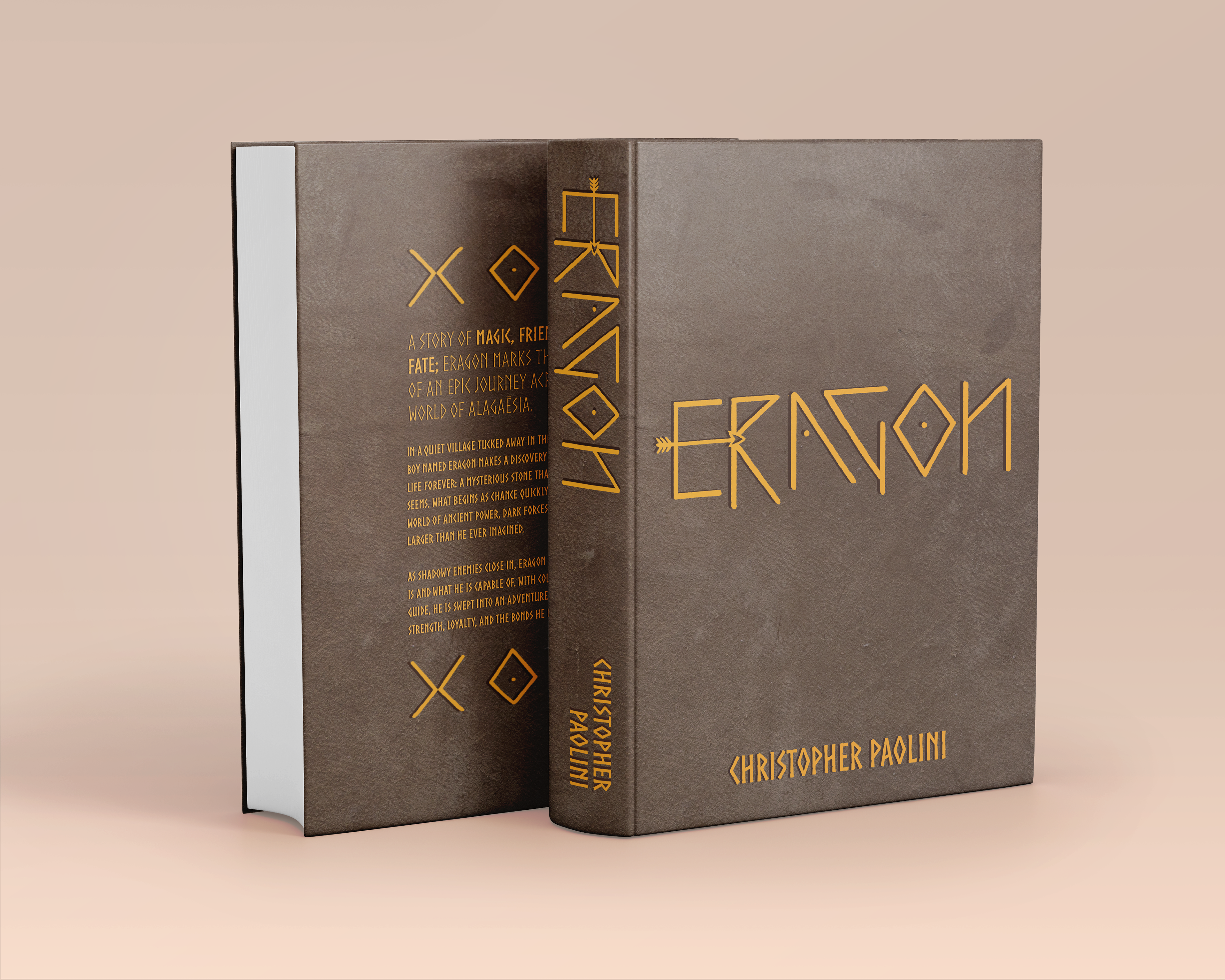
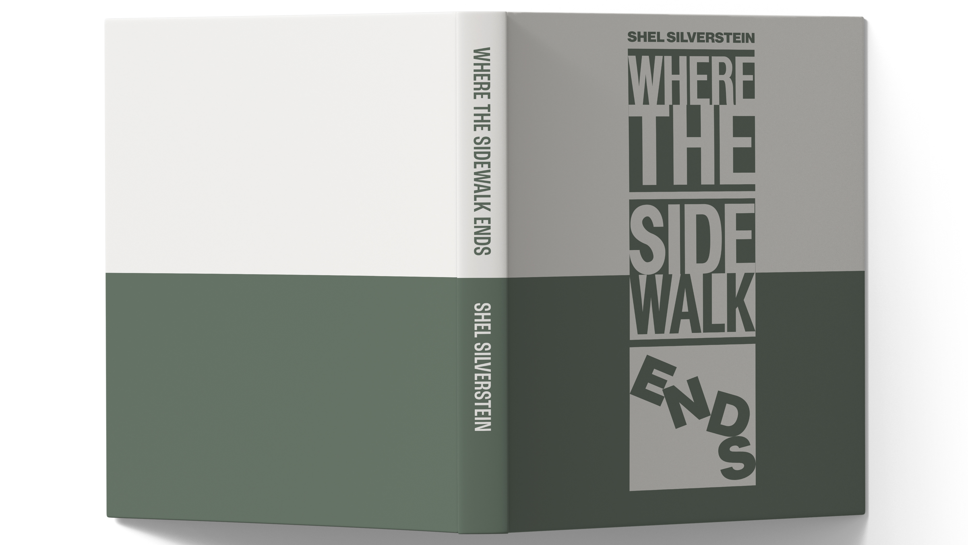
Developing another sketch reignited my lost passion for the project. Once my excitement returned, I began working on the final rendering of the cover and its accompanying animation.
Using the app "Artivive," I uploaded my hand-drawn animation so that it can be viewed in real time with any image of the cover. This enables a layer of interaction that is not possible with many traditional covers and posters. Try it yourself!